sans serif
modern
elegant
avant garde
simplicity
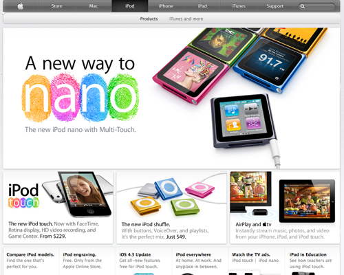
Apple
traditional
conservative
classical
established
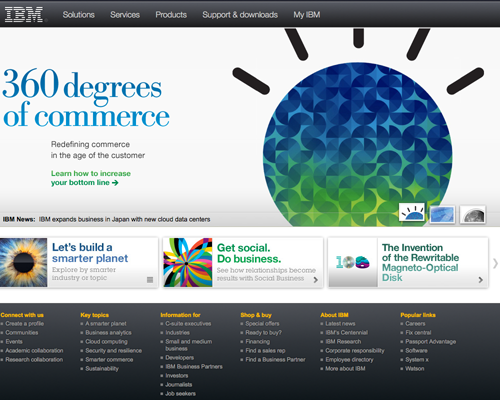 IBM
IBM
Originally IBM was using serifs for their titles as you can see in the image above but since I created this page they have started using all sans serifs for their titles.