
CSS3 - 2DTransform & Transitions w3c
intro | transitions | scale | rotate | translate | skew | origin | examples | browser support
Transform - Rotate
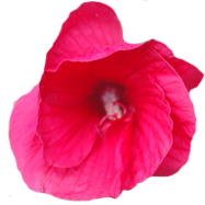
I am using the hover to generate the rotate transform on the image below. The flower is set to rotate 360 degrees (360degs) for half a second.
transform:rotate(360deg);
transition-timing-function: ease;
transition-duration: .5s;
Alert
Mobile devices do not responed to the hover therefore you need to click on the image/s in order to see the effect.
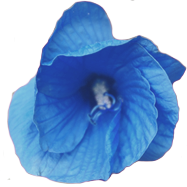
Even though by clicking on the image you can generate the transform it still does not work correctly on all touch devices. Because there is no hover the reverse transform cannot happen when the user rolls off but it is generated when the user clicks on another transform. The blue flower has been added for some mobile devices to demonstrate this.
Rotate - Styles
Below is are the styles used for the rotate.
The first set of styles will allow animation when the user rolls out:
#rotate{
-webkit-transition: all .5s ease-out;
-moz-transition: all .5s ease-out;
-o-transition: all .5s ease-out;
-ms-transition: all .5s ease-out;
transition: all .5s ease-out;
}
These are the main set of styles that will trigger the rotate transform on the hover
#rotate:hover{
-moz-transform:rotate(360deg);
-moz-transition-timing-function: ease;
-moz-transition-duration: .5s;
-webkit-transform:rotate(360deg);
-webkit-transition-timing-function: ease;
-webkit-transition-duration: .5s;
-ms-transform:rotate(360deg);
-ms-transition-timing-function: ease;
-ms-transition-duration: .5s;
-o-transform:rotate(360deg);
-o-transition-timing-function: ease;
-o-transition-duration: .5s;
transform:rotate(360deg);
transition-timing-function: ease;
transition-duration: .5s;
}